Commit Graph
12 Commits
Author SHA1 Message Date
Cameron RadmoreandGusted 6b75654cc2 chore: enforce RTL-friendly logical CSS properties with a linter (#12491)
Related issue: https://codeberg.org/forgejo/forgejo/issues/8581

This should be a nice first step towards RTL support. Future PRs can look at updating the tailwind classes, changing some of the icons (arrow left might need to become arrow right in some cases for example, and updating the template files)

Reviewed-on: https://codeberg.org/forgejo/forgejo/pulls/12491
Reviewed-by: 0ko <0ko@noreply.codeberg.org>
2026-05-11 00:20:45 +02:00
0ko 563291579e fix(ui/mde): fix switch height and buttons alignment (#9545)
Followup to https://codeberg.org/forgejo/forgejo/pulls/9359.

The custom height override for the switch in MDE was not taken into account in that PR.
* How it used to be: constant height + variable padding for different scenarios
* How it works now: there's no padding, just variable height

After the change the override that was supposed to decrease the padding started increasing it from 0, making the switch too tall.

Also two of the buttons on the toolbar used to have a completely unused `button` class, which detonated them after it was globally implemented, so it was removed.

First time a button with this class was added in 4615891b9d, then it was duplicated in 6dad457552. Modals do not depend on presence of this class:
https://codeberg.org/forgejo/forgejo/src/commit/6610eb1dbfa16f88e4f685141735b7b719cb3de8/web_src/js/features/common-global.js#L441

Preview:
B: https://codeberg.org/attachments/5d10ac6e-45b3-4cd3-8083-f446824d4310
A: https://codeberg.org/attachments/93a00f69-56a6-4c02-93d8-6080f51d273f

Reviewed-on: https://codeberg.org/forgejo/forgejo/pulls/9545
Reviewed-by: Gusted <gusted@noreply.codeberg.org>
2025-10-08 17:53:50 +02:00
BeowulfandEarl Warren 1cd0c5e99b fix: prevent page jumps due to textarea auto resizing (#7569)
The change prevents unnecessary resizing of the text field.

## Testing

- Compose some text e.g. in an issue
- Enter a lot of lines, until the compose field is as big as possible
- Move the screen up, the top of the compose field should leave the screen, but the last e.g. 5 lines should still be visible on the screen
- Append some text
- Make sure the textfield just gets bigger, but doesn't jump to the bottom of the page

Fixes #7522

Reviewed-on: https://codeberg.org/forgejo/forgejo/pulls/7569
Reviewed-by: Earl Warren <earl-warren@noreply.codeberg.org>
Co-authored-by: Beowulf <beowulf@beocode.eu>
Co-committed-by: Beowulf <beowulf@beocode.eu>
2025-10-01 03:47:19 +02:00
0koandGusted 282125e90f fix(ui): ensure consistent switch position in markdown editor (#7492)
Followup to https://codeberg.org/forgejo/forgejo/pulls/7481.

Fix a bug reported by @Gusted where the switch would jump ~1px up when switched to preview mode.

It was because the switch is always center-aligning to the largest element in the toolbar. With toolbar buttons disappearing, the largest element was the switch itself. By placing it in a box with same height as the buttons we can ensure it can always stay in the same position.

Reviewed-on: https://codeberg.org/forgejo/forgejo/pulls/7492
Reviewed-by: Gusted <gusted@noreply.codeberg.org>
Co-authored-by: 0ko <0ko@noreply.codeberg.org>
Co-committed-by: 0ko <0ko@noreply.codeberg.org>
2025-04-09 17:37:46 +00:00
0ko afffbe2982 ui: use switch for markdown editor modes (#7481)
Replaces https://codeberg.org/forgejo/forgejo/pulls/5478
Closes https://codeberg.org/forgejo/forgejo/issues/244

Use switch for preview mode switching instead of tabs. It is placed in line with the toolbar buttons.

Preview:
* https://codeberg.org/attachments/38910747-c14c-41d1-9935-c35f3e17033b
* https://codeberg.org/attachments/ff8ea47a-f157-424f-8b7f-af1008d5e8b5

Reviewed-on: https://codeberg.org/forgejo/forgejo/pulls/7481
Reviewed-by: Gusted <gusted@noreply.codeberg.org>
Reviewed-by: Beowulf <beowulf@beocode.eu>
2025-04-07 13:47:13 +00:00
Danko AleksejevsandEarl Warren 36b6444f34 Remove tab key handling in markdown editor, add toolbar buttons instead, re #4072 #4142 (#4263)
We haven't decided much (to my knowledge), and I've been using the main branch in production (as one does) and found out even I myself rely on Tab sometimes working to move focus and have been caught off guard by it indenting lines instead.

So this removes Tab handling and instead adds two new buttons to the toolbar. The indentation logic is unchanged (other than now focusing the textarea during button handling, to ensure execCommand works, and thus undo history is preserved).

I'm not sure which terminology to use in tooltips. Could also add keyboard shortcuts for the whole toolbar eventually, but as is this is hopefully an better solution to the problems I previously created than un-merging the whole thing :)

<img width="414" alt="Screenshot with two new buttons" src="/attachments/b7af3aa4-a195-48d1-be0a-1559f25dce8e">

Reviewed-on: https://codeberg.org/forgejo/forgejo/pulls/4263
Reviewed-by: Otto <otto@codeberg.org>
Reviewed-by: Earl Warren <earl-warren@noreply.codeberg.org>
Co-authored-by: Danko Aleksejevs <danko@very.lv>
Co-committed-by: Danko Aleksejevs <danko@very.lv>
2024-06-30 13:03:32 +00:00
silverwindandEarl Warren aefc747ccb Clean up diff header css and reduce global textarea min-height (#29232)
1. Tweak diff header and remove a numbe of unneeded CSS for it:

Before:
<img width="433" alt="Screenshot 2024-02-18 at 01 08 09"
src="https://github.com/go-gitea/gitea/assets/115237/d8b377c0-57bc-44d5-bb57-a582c7d4b3b4">

After:
<img width="463" alt="Screenshot 2024-02-18 at 01 07 56"
src="https://github.com/go-gitea/gitea/assets/115237/d08c17e7-5b86-4d07-81da-6371f4754325">

3. Reduce height of review textarea and also reduce fomantic's CSS from
12em to 8em. Now fits better on my screen:

<img width="1352" alt="image"
src="https://github.com/go-gitea/gitea/assets/115237/5c658d13-295e-4929-94da-13ade888020d">

---------

Co-authored-by: delvh <dev.lh@web.de>
(cherry picked from commit 39f8ab591c18a65cf783ecd17ddc1a5914ceff7a)
2024-02-19 22:58:33 +01:00
silverwindandGitHub a50002c75c Fix z-index on markdown completion (#27237)
Fixes: https://github.com/go-gitea/gitea/issues/27230
2023-09-25 01:29:36 +02:00
dca2f9371d Unify border-radius behavior (#26770)
## Changes
- no more hardcoded `border-radius`es (apart from `0`)
- no more value inconsistencies
- no more guessing what pixel value you should use
- two new variables:
- `--border-radius-medium` (for elements where the normal border radius
does not suffice)
  - `--border-radius-circle` (for displaying circles)

---------

Co-authored-by: silverwind <me@silverwind.io>
2023-08-28 19:43:59 +00:00
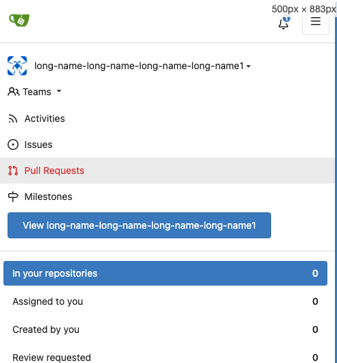
00dbba7f42 Several fixes for mobile UI (#25634)
Resolves #25622 

<details>
<summary>Screenshots</summary>

![Bildschirmfoto vom 2023-07-02
20-47-34](https://github.com/go-gitea/gitea/assets/47871822/a8a0bff6-9ae3-48f3-b008-00c196a3f8fd)
![Bildschirmfoto vom 2023-07-02
20-47-45](https://github.com/go-gitea/gitea/assets/47871822/172a0021-af74-4690-aa67-0e66688ce733)
![Bildschirmfoto vom 2023-07-02
20-48-37](https://github.com/go-gitea/gitea/assets/47871822/14572ebd-0106-4c8a-ba27-b6b631375ee6)
![Bildschirmfoto vom 2023-07-02
20-49-08](https://github.com/go-gitea/gitea/assets/47871822/7c0ba3aa-1712-482c-aae9-13394dbdaf8a)
![Bildschirmfoto vom 2023-07-02
20-50-28](https://github.com/go-gitea/gitea/assets/47871822/8bd68e26-099a-4abd-8817-16d52af13167)
![Bildschirmfoto vom 2023-07-02
20-51-46](https://github.com/go-gitea/gitea/assets/47871822/3beab8c6-3747-4829-be50-bafaed11000c)
![Bildschirmfoto vom 2023-07-02
20-54-12](https://github.com/go-gitea/gitea/assets/47871822/51f82ef3-a32c-4c27-9056-e8711ed469cc)


</details>

---------

Co-authored-by: wxiaoguang <wxiaoguang@gmail.com>
Co-authored-by: silverwind <me@silverwind.io>
2023-07-04 17:45:45 +00:00
silverwindandGitHub 19993d8814 Change --font-weight-bold to --font-weight-semibold and 600 value, introduce new font weight variables (#24827)
There was some recent discussion about this in Discord `ui-design`
channel and the conclusion was that
https://github.com/go-gitea/gitea/issues/24305 should have fixed their
OS font installation to have semibold weights.

I have now tested this 601 weight on a Windows 10 machine on Firefox
myself, and I immediately noticed that bold was excessivly bold and
rendering as 700 because browsers are biased towards bolder fonts. So
revert this back to the previous value.

2023-05-21 23:37:32 +00:00
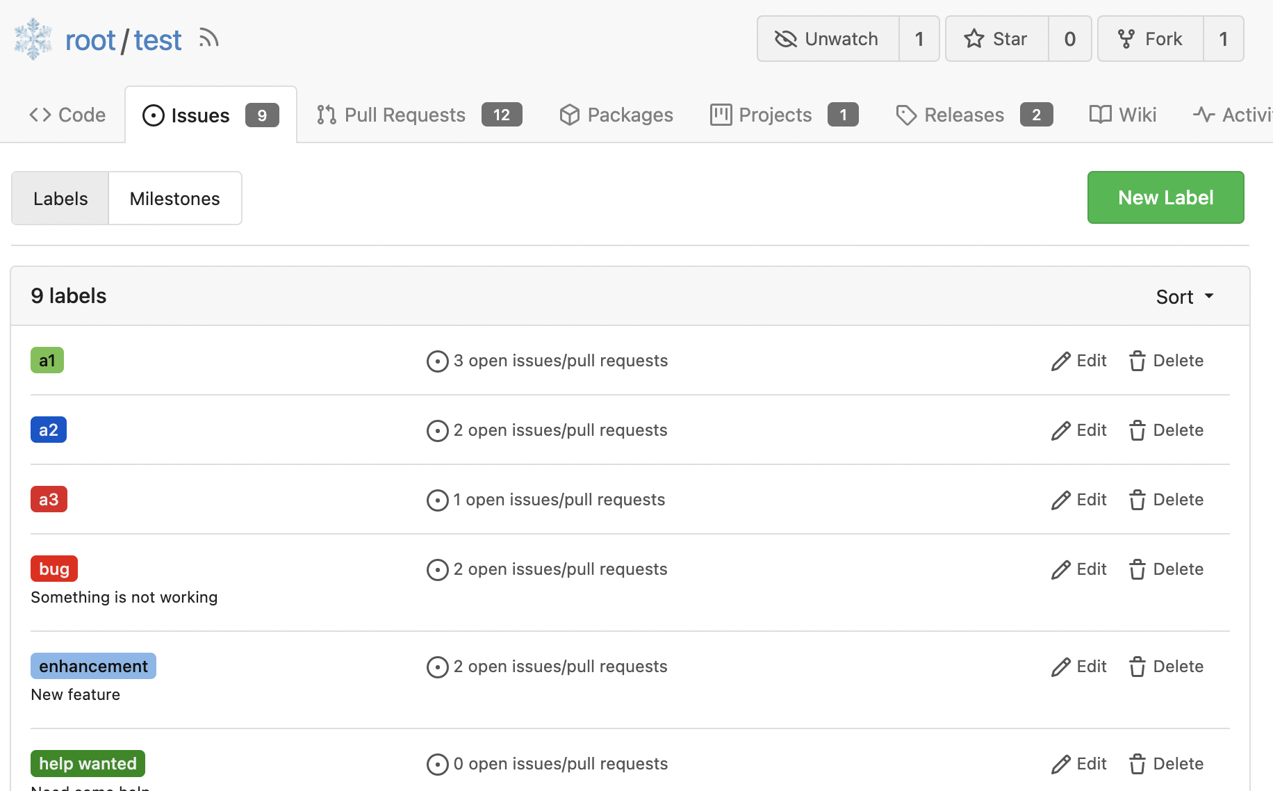
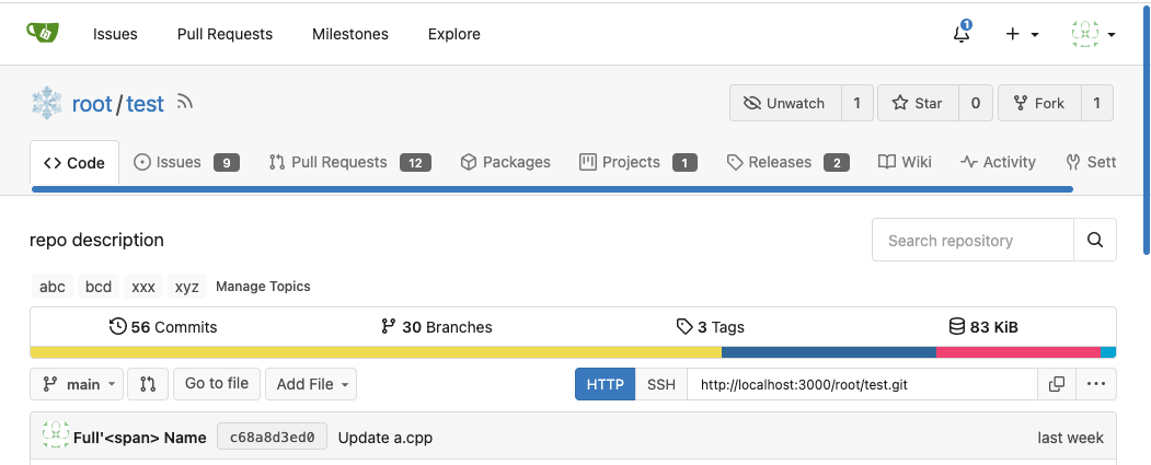
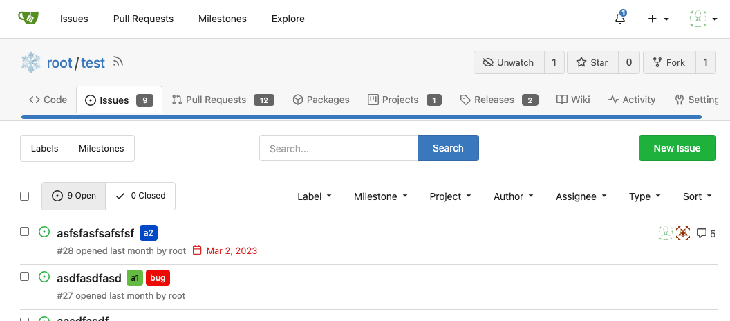
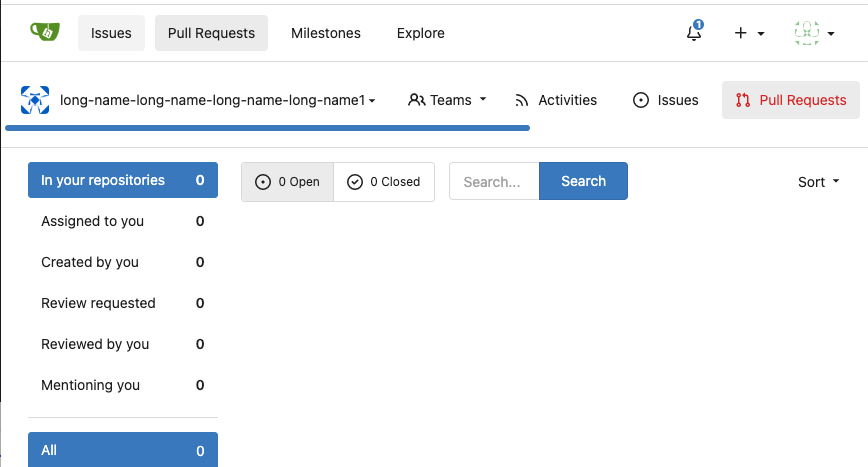
wxiaoguangandGitHub 5a5ab8ef5a Start cleaning the messy ".ui.left / .ui.right", improve label list page, fix stackable menu (#24393)
Since 2015/2016, there is a global pollution: ".ui.left" / ".ui.right".

Fomantic UI doesn't work this way, it just conflicts with many Fomantic
definitions.

This PR starts the cleaning work of such techinical debts.

And, the "label list" page has been quite messy for long time, for
example, why "li" appears in "div" ......

And fix #24296

<details>


![image](https://user-images.githubusercontent.com/2114189/235051281-54c5374c-b5fd-4b5f-9aa2-02d4bb2d9112.png)


![image](https://user-images.githubusercontent.com/2114189/235055703-2ba042e0-4db7-4e63-8646-02f390d496b5.png)


![image](https://user-images.githubusercontent.com/2114189/235056310-4f6ffdc2-5758-4927-8fb8-314d9fb72a6b.png)


![image](https://user-images.githubusercontent.com/2114189/235058400-dab1c9ec-3325-4671-8345-aee6b0b68042.png)


![image](https://user-images.githubusercontent.com/2114189/235058424-85509532-b9bc-43ad-b00f-a87184c60f22.png)

</details>
2023-04-29 07:35:59 -04:00